Nobody can tell you for sure what’s going to happen next in the stock market. But thanks to the nice data set collected and maintained by Yale Professor Robert Shiller we can speak with authority about what it’s been doing for the last 140 years.
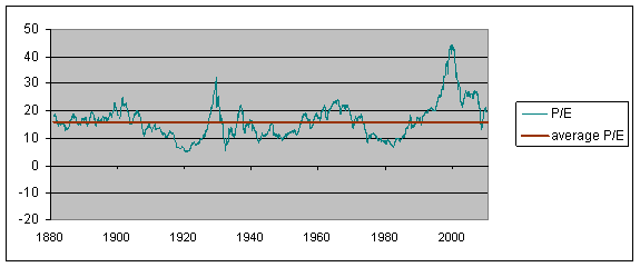
Let me begin with an update of one of Professor Shiller’s graphs to which I’ve often referred. The green line is a price-earnings ratio on the S&P500 or earlier counterparts. So as not to overstate the impact of temporary spikes up or down in earnings, Shiller relates the current inflation-adjusted stock price to the previous ten-year-average of inflation-adjusted earnings. Despite the recent correction in stock prices, stocks still cost more today relative to the earnings you’re buying than they did over most of the previous century and a half. We’d still need about another 17% decline in stock prices to get back to the historical average valuation multiple.
 |
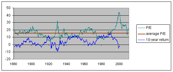
One reason that might be worth paying attention to is the following graph, whose blue line shows the annual rate of return you would have earned by buying stocks at any indicated date and holding on to them for the next decade. The green line (the price-earnings multiple) you would know at the indicated date, whereas the blue line (the return on stocks over the next decade) you wouldn’t know until 10 years after the indicated date. What is pretty clear in hindsight is that those dates at which stocks were very richly valued turned out to be terrible times to buy. Anyone who was unfortunate enough to have decided to get into the stock market at the peak P/E in 2000 can testify that the most recent data have continued to confirm this century-long relationship.
 |
But shouldn’t we be comparing stocks not with a historical average, but instead with the currently very low yields available on alternatives like bonds? The next graph compares bond yields with stock yields, with the latter defined as the ratio of stock dividends to stock prices. Unlike the previous figure, this might appear to be a very unstable relation, with stock yields consistently above bond yields for the first half of the sample and consistently below for the next.
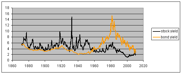 |
To understand what’s going on with that last relation, we also need to factor in inflation. Apart from an impressive spike in the price level in 1917-1919 associated with World War I, the first half of the sample was characterized by stable or falling consumer prices (deflation) and the second half by steadily rising consumer prices (inflation). Bond yields and stock yields pull apart when there is inflation because, unlike bonds, a stock is a real asset. With inflation, the dollar price of the company’s product should be going up, and with it the company’s nominal profits and dividends. To be sure, there can also be important relative price changes, so that some sectors will see their costs go up relative to product prices, while those selling them those inputs may experience the opposite. But certainly in an overall inflationary environment, we should expect to see the dividend yield well below the bond yield. In fact, the dividend was not far enough below nominal bond yields at the peak inflation of the late 1970s to be associated with a rational valuation of stocks. This may have been one factor in the below-average price-earnings multiples of that period (low green line in Figure 2 in late 1970s), and people who bought stocks at that time were richly rewarded (high blue line in late 1970s).
 |
Even in an environment of stable consumer prices, we would still expect to see dividends grow as a result of growth of the real economy. But in the deflationary episodes of the earlier part of the sample, the stock dividend yield was usually well above the corresponding bond yield. Investors regarded stocks as sufficiently more risky relative to bonds that they sought compensation for taking that risk in the form of both a higher immediate yield as well as prospects for future dividend growth.
The next graph takes a more detailed look at the most recent behavior of stock and bond yields. Over this more recent period we can also compare the stock dividend yield directly with the yield on Treasury Inflation Protected Securities, which is more of an apples-to-apples comparison than Figure 3. A buyer of stocks today is usually getting a higher immediate yield than on TIPS, in addition to prospects of future dividend growth. Just as they did in the 19th century, stocks as priced today should give you a significantly better return than bonds.
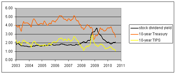 |
But, now as then, stocks are also significantly more risky than bonds.
Should the parenthetical right before figure 4 read, “late 1980’s”? Ten year lag and all?
I thought I followed you all the way until you hit the TIPS analysis. If stocks are still overvalued on a (lagged) P/E basis based they should outperform bonds? Are you basically saying everything is overpriced right now but on a relative basis stocks should do less poorly than bonds? A bet that we will get inflation?
TIPs have a value beyond what one would expect for an instrument with a face-value linked to the CPI: the value can never fall below the issue price. So if we are about to experience a period of mild deflation followed by significant inflation, newly issued TIPs can’t be beat.
I bought some 20 year TIPs in January 2009 that yield 2.5%. I sure wish I had bought a lot more of them….
Rob: The blue line plotted at the point Jan 1980 on Figure 2 is the return between Jan 1980 and Jan 1990. The green line at the point Jan 1980 is the P/E as of Jan 1980. So the green line says that Jan 1980 was a good time to buy stocks, and the blue line at Jan 1980 confirms that yep, it would have been a very good idea to buy in Jan 1980.
Ugh [smacks forehead], thanks Prof.
Bob_in_MA
likewise feeling about previously purchased TIPS, but would you buy the 30yr TIPS that go on sale tomorrow?
Nowadays, population is stabilizing which will mean lower growth and returns of all kinds going forward, so P/Es should drift higher and earnings yields decline for the next half century. Growth may be a little faster than past levels less population growth with greater capital, knowledge, and technology, but no where near their historic levels when population amounted to half of it.
I currently have some bond funds, bought slightly ahead of the rush. My vanguard TIPS are up 12% over something like a year.
I get the feeling that I should stop being lazy and abandon the funds for discrete bond holdings that match my timeline (holding to maturity). It would be better if I did that in the next tax year.
Bond funds take an “extra” bath when interest rates climb, right? as fund managers must sell more than dogs for redemption?
Here’s a link with Shiller’s historic stock market data in a more user friendly format:
The S&P 500 at Your Fingertips
In addition to sampling the data for any two months during that 140 year period, the tool will also calculate the rate of return between them, both with and without the effects of inflation and with and without the reinvestment of dividends.
Use this tool to see how a hypothetical investment, or series of investments, would perform (adjusting for inflation) between any two months covered by Shiller’s data.
Oh, and Shiller’s P/E10 ratio (price to average inflation-adjusted earnings over a ten year period) is not the best measure for determining what the proper value of stock prices should be….
I’ll confess, I’ve never been comfortable with Shiller’s use of P/E is a backward-looking tool, and find it hard to interpret the meaning of a ten year period looking back.
But, OK, suppose you applied the rule: when the P/E ratio rises above historical norms, you no longer invest in equities because the ratio is ‘unsustainable’.
Well, it did that last (excluding the recent dip) around 1990. The ratio has been above the historical average pretty much since then. The S&P 500, on Jan. 2, 1990 was 340, and on Friday closed at 1,072. Do the math, and the compound annual return is 5.9%, excluding dividends, which appears to be 2% or so. So equities would appear to have returned about 8% (hope I have my math right) per annum over a 20 year period during which Shiller’s rule might have told us to avoid them.
Personally, I might prefer an index like this:
P / (revenues of S&P 500 companies / GDP)
In any event, the P/E ratio is part of the story, but not all of it.
There seem to be several issues with the P/E valuation to returns proposition – there are only around a dozen independent periods; earnings are not reported at year end, or get delayed or revised; different sources disagree on S and P earnings; and one needs to watch for look-ahead and look-back bias.
Niederhoffer devotes a chapter of Practical Speculation to actually using P/E valuation techniques. Using only data available to a real investor, he looks at P/E ratios to returns over several time periods and finds little correlation.
Smithers in Wall Street Revalued is a bit more hopeful. He finds CAPE (and q) to have a weak forecasting ability, while reminding us that if the correlation was too strong it would be exploited.
My personal feeling is it’s something to keep in mind, but I wouldn’t bet too heavily on it.
Current population is 310 million.
Estimates of the population in 2050 range from 350 million to well over 400 million.
While it’s a far slower rate of growth than in the past half century, I’m not sure I would describe that as the “population stabilizing”.
There is a slight misrepresentation of stock dividends paid as being the total expected yield from holding onto equities. Investors hold on to assets for total return, which includes price appreciation from earning retained within the firm for useful growth of the firm’s business. If dividends have been lowered over the course of this very long period, for say tax purposes or for enlightened businesses that see improved enterprise value through the retainment of earnings versus dividends,then this analysis falls somewhat to the waste side. The first couple of graphs were very interesting, but total return from assets is apples to apples.
Professor Hamilton post was already deep in substance, now justice is to be given to Ironman for his ever original scientific methods as applied to surrealism,the equities markets!
In the stocks markets history(ies) ie noise is relevant,the log charts compress the noises.The rate of growth of dividends (derivative) as opposed to dividends in the equation is a component of smoothing.Reading the charts buy and hold the SP500 index could look like a healthy reasoning.
The SP500 constituents are changed in accordance with companies abilities to deliver profits (assumption new constituents will deliver the same profits or more than the former)
The SP500 constituents are showing profits (banking) when their accounts are dubious,(assumption borrowing the present for a better future)
Liquidities are not priced (Professor Hamilton may through his current project, show that liquidities did play a major role in this decade)
Public Pension funds,taxes and revenues streams are relevant.The IMF estimates,”10% decline in the equities markets lead cyclically adjusted revenues to fall by 0.07/0.08% of GDP
IMF “throughout 2008 the public pension of the US and UK lost respectively 22% and 31%of GDP”
The best equities forecasters are government representatives.
PEG ratio is what you use to determine if a stock is a buy. In Shiller market terms it would tell you what a trailing smoothed PE is relative to forward looking growth potential. In other words, a PE of 15 might not be expensive if long term GDP growth prospects ran at 4%/year. (assumming corporate profits growth more or less inline with the economy.) But a PE of 15 may be a rotten deal if long term growth is 2%.
But I’m the only one that knows this, so all stock investors are still safe.
Since WW II the long run trend for SP 500 earnings growth has been some 7%. If you use this trend to calculate a “Normalized” PE the current PE is around 15. Based on the relationship that prevailed from 1960 to 1995 at current interest rates the PE should be slightly over 20. That implies the market is cheap.
But is it? I’ve long viewed the PE as an expression of the present value of a perpetual stream of 7% earnings growth. But if we are entering an extended period of stagnation — like the Japanese lost decade or the US long depression — the long term trend of earnings growth will slow significantly below the historic 7% norm. Interestingly, the trend growth Rate for nominal GDP growth has also been about 7%. Is the market in its infinite wisdom already starting to discount a significantly slower long term trend growth rate for earnings.
In the 1990s investors came to believe that the long term growth trend for earnings has shifted up from the 7% historic norm and this justified the 25 to 30 PE on trailing operating earnings that prevailed in the 1990s. In the early 1950s when investors feared a return of the 1930s depression if peace broke out, the market PE was at or below 10. So we have examples of the market’s expectations of long term earnings growth shifting both up and down.
John: I disagree. It is perfectly sensible to view the stock price as the capitalized value of the expected present value of the flow of future dividends. If you buy at t and sell at t+s, you are basically just cashing in on whatever the capitalized value of that flow is at t+s.
From here, growth is in the retired population, so yes, that is what a stabilizing population looks like.
JDH,
Yes, but dividends generally rise with growth and/or inflation, while bond interest explicitly does not.
I’d take blue chip non-financial stocks yielding 3% over long Treasuries at similar rates.
I guess I would have to say in todays environment that its not whether stocks will outperform most bonds (excluding junk bonds that ultimately default) but whether the risk tolerance and landscape has changed over the past 3 years where investors may not be comfortable for the volatile markets and of course uncertainty of what we are seeing unfold politically and economically around the world. So even if equities are due to outperform. Also with inflation subdued at the moment as we try to figure out if the fed is out to battle deflation which would of course drastically change these charts when we revisit this experiment in a decade.
Great article
I think the simple P/E ratio we are considering is more of a proxy for investor expectations of future stock prices than the backward looking metric it appears to be.
The ratio varies by sector, with high growth sectors commanding higher P/E multiples. In other words, I’ll pay more today for a given level of lagged returns, if I expect a higher rate of return in the future.
Viewed in this light, we can clearly see how bubbles are driven by ‘irrational’ expectations of future growth prospects, ie, unsustainable periods of abnormally high P/E ratios.
Anonymous,
I’m not sure it makes sense to buy a 30-year TIP that yields less than 2%. Maybe things will go whacko again and 20-year TIPs will yield more than 3% again, like in late 2008:
http://research.stlouisfed.org/fred2/series/WFII20?cid=82
I think that there is a reason to believe that we had a permanent increase in the equilibrium p/e ratio after about 1990 (since when it has been much higher on average than earlier, although clearly the 90s were a bubble). That is the fall of Soviet socialism around 1990. Buried in the lower earlier p/e’s was an implicit risk premium on possible nationalizations of companies if countries went socialist, although we basically never had that in the US. But many other countries did. While it might have increased slightly recently, this probability of nationalization remains far lower than it was prior to 1990, thus justifying some permanent increase in the long-run p/e, if not by all that much.
Bob_in_MA,
“TIPs have a value beyond what one would expect for an instrument with a face-value linked to the CPI: the value can never fall below the issue price. So if we are about to experience a period of mild deflation followed by significant inflation, newly issued TIPs can’t be beat.”
That is not correct. The only deflation protection TIPS offer is that you are guaranteed to get your original principal at maturity. That’s it.
Mild deflation would pull their inflation adjusted value down below their original value and the inflation to come later would then push it back up.
Nearly my entire nest egg sits in TIPS by the way.
http://www.treasurydirect.gov/indiv/research/indepth/tips/res_tips_rates.htm
1. Locate your TIPS on the TIPS Inflation Index Ratios page. Follow the link and locate the Index Ratio that corresponds to the interest payment date for your security.
2. Multiply your original principal amount by the Index Ratio. This is your inflation-adjusted principal.
3. Multiply your inflation-adjusted principal by half the stated coupon rate on your security (i.e., 2%). The resulting number is your semi-annual interest payment.
That Index Ratio can and has gone below 1.0.
Bob_in_MA,
One more thought. I also own I-Bonds. They are also tied to the CPI. Like TIPS, that rate is locked in for the life of the bond.
During deflation, their value can never fall. The reason is that they grow only through interest and that interest can never be below 0%.
During inflation, their value will rise.
A truly great environment for I-Bonds would be as you suggest. Years of deflation where their value cannot fall followed by years of inflation where their value can rise. Win win.
Further, I-Bonds can grow tax deferred up to 30 years. That’s a huge win if inflation picks up.
You can also cash them out after 1 year (with a 3 month interest penalty) or after 5 years without a penalty. If interest rates spike much higher, you won’t take a loss when you cash them out either. You always know exactly what they are worth and they never require a “greater fool”.
I’ve been buying I-Bonds every year since 2000. They paid 3.4% over inflation back then.
Unfortunately, they only pay 0.2% over inflation now. The government also reduced the amount we can buy each year by 83% as of January 1, 2008.
wow. this ignores non-substitutable resources (nameley low cost energy and water) as primary driver of stock market wealth (which is a tertiary marker – a derivative of natural capital). If you adjust the Cobb Douglas function to account for energy as a separate input factor, and you acknowledge that the additional energy to the system has entered a new paradigm of scarcity, then one could argue (and I do) that not only is the broader stock market overvalued in real terms, but a decade or so hence, possibly sooner, ‘the stock market’ won’t be on our radar screens on how we measure things.
Remember that indexes overestimate stock price gains because of the way stocks are replaced when companies fail.
The improved performance of stocks relative to bonds post-war was a result of the baby boom, the increased popularity of stocks as a retirement investment among boomers, and a change in investor preference for capital gains over dividends. Boomer retirement thus can be expected to put downward pressure on P/E ratios in coming decades, as they redeem their retirement savings by selling the stocks of companies that don’t and likely can’t pay much in dividends to a smaller, less to a smaller, less hot-for-stocks generation.
Additional clarity is needed on the blue line in the second graph. Is that a total return, i.e. with dividends reinvested, or is it a price return?
Secondly, that blue line ought to be a real return to be more informative.
tew: The blue line in Figure 2 is the 10-year nominal price change quoted at a continuously compounded annual rate. Note from the black line in Figure 3 that the episodes of high P/E were also characterized by low current dividend yield, so a return with dividend reinvestment would likely make the conclusion even stronger, though I have not calculated this.
We did a brief review of PE ratios for historical time periods from 1920 to 2001 and have concluded that PE ratios may have no predictive pwoer. For example, in 1933 the PE on the Dow was as high as 52 that year’s earnings, yet the next year the average Dow price was up 17%. In 1981 the Dow sold for eight time earnings yet the following year the average Dow price was down almost six percent. A regression model showed that there was no relationship between the next’s year’s percent price change and the prior year’s PE.
In 1998, national GDP was around 8.6 trillions. Today, it hovers the 14+ mark. On March 1998 -12+ years ago- the SP500 was trading at 1121, a ~4.8% premium to today’s prices!! Can someone honestly say nothing has changed in the last 12 years which would be like saying that there has been no internet, Google never existed and that we are still speaking on mobile phones that are the type of relics like the one Michael Douglas was using in the movie “Wall Street”? Stocks are cheap now. Do not let the fog and the pessimists muddle your vision. Neither well constructed theories that go back 140 years. After Bretton Woods and specially after 1971, markets have behaved differently.
Stocks may still not rise, but not because they haven’t reached an ultra low pe but for many other reasons. Including some that border mass psychology.
Many commenting here would be wise to remember Keynes’ remark that the stock market may remain irrational longer than you can remain solvent. Plus his one liner about the long run.
People make lots of money in volatile financial markets like the current ones and not by using Cobb-Douglas functions or the Schwartz-Metterklume Method.
A&G: 1933 is an excellent example of why Shiller proposed using a ten-year average of inflation-adjusted earnings rather than current earnings. You’ll see from Figure 2 that the green line signals 1933 as a good time to buy, and the blue line confirms that indeed it proved to be.
Cedric Regula and tj: One advantage of the simple backward-average of earnings rather than forward expectation is that one can easily construct the former on an objective basis going back 130 years. For the forward earnings part of P/E, whose expectations do you use today, and whose expectations do you use for 1933, and are you sure you trust both of those measures?
JDH,
“For the forward earnings part of P/E, whose expectations do you use today, and whose expectations do you use for 1933, and are you sure you trust both of those measures?”
To quote the Curly of the Three Stooges, “Ceointently Not!”
The way I’m thinking is I like Shiller’s smoothed trailing PE based on data. (tho quality of earnings and off balance debt is a historical consistancy problem too.)
Then I do know roughly what GDP growth was over these historical periods, and could even look it up if I wanted to.
Then I just need to assume that earnings growth for the stock market as a whole roughly tracks GDP growth. Since dividends are paid from earnings, I don’t need to bother with dividend valuation models.
Since my goal is not to predict PEs based on forward expectations (because expectations are what are usually proved wrong) I just use the CBO estimates and my gut feel for the 10 year outlook for the economy and GDP growth. If that looks like it will be half of what it was in the last 20 years, and you believe stocks discount future earnings, then I just assume we have a problem when we are at or above Shiller average PE ratios.
Obviously I missed most of the rally over the past year or so.
A&G,
You’re using too short a time period. PE ratios are very predictive of forward 10-year returns.
One reason dividend yields are lower since 1980 is because of changes in the tax treatment of capital gains vs. dividends. Many companies today aren’t paying dividends, and never intend to. And many investors don’t particularly care if they will in the future or not.
With the P/E currently around 20, you are looking at a current earnings yield of around 5%. Compare that with 10 year treasuries yielding about 2.6%.
Reported Earnings over the last 10 years have had two unusually weak periods (2008 and post dot com 2002-2003)relative to trend. So the current E in P/E is pretty low using Dr. Shiller’s 10 year inflation adjusted average.
I think we miss out on a great deal of the power of the Shiller model if we fail to consider WHY it is that the P/E10 level gets as high as it did in the late 1990s. It does not get there because investors are making rational choices. It gets there because investor EMOTIONS get out of hand.
If you look at the historical record, you will see that we have gone beyond a P/E10 of 24 four times in U.S. history. On each of the first three times we ended up not at a fair-value P/E10 but at a P/E10 level of one-half of fair value. That’s because extreme emotion in one direction begets extreme emotion in the other direction. Investors create funny money when they push the P/E10 above 24 and then go into a panic when they recognize that the funny money is not real.
If we are going to a P/E10 value of one-half fair value this time too, we have a price drop of about 65 percent from where we are today coming up sometime over the next few years. We need to stop doing things to encourage excessive emotion (Buy-and-Hold tells investors not to worry themselves about high prices) and start encouraging investors to follow practices that rein in emotion (if investors sold stocks each time the long-term value proposition dropped because of rising valuations, extreme overvaluation would become a logical impossibility).
Rob
Are we certain that investors have not acted rationally concerning interest rates and PE? For the period 1965 through 2002, when year-end five year Treasury yields were about 14%, the PE ratio on the S&P 500 was about eight. When the five year yield was about eight, the PE was about 15 and when the five year yield was about three, the PE was about 30.
I must be missing something obvious. Can some clarify my understanding.
As prof Hamilton pointed out:
“With inflation, the dollar price of the company’s product should be going up, and with it the company’s nominal profits and dividends.”
My interpretation of this statement is dividend goes up during inflation(am I misinterpreting the statement?). If so, that seem to contradict figure 3. From fig 3, dividend yield during period of deflation (period befor 1960 in figure 3) is higher than during period of inflation (after 1960 in figure 3).
Joe: The dividend yield is the ratio of dividend to price. The dividend yield can thus go down even when the dividend goes up.
I too agree to your point that no one can predict whats going to happen in next minute in stock market.
But justifying to my doubt i would like to make it clear that are you saying that everything is overpriced now??
you know, trends go on until they stop.
the significance of that is that we’ve had fiat money for the length of this chart. when the end comes to fiat money, it will knock your charts into a cocked hat.
do you really think the US, Japan, the UK, etc are going to pay off the debt they’ve accumulated w/o destroying the currencies? It is virtually impossible.
{^ ^}: Figure 3 begins in 1870. The U.S. Federal Reserve was created in 1913. The original green paper the Fed issued were called “gold certificates” and entitled the bearer to convert to gold coins on demand. The U.S. went off the gold standard in 1933.